


Angelo Caro's Red Bull Poster
This fictional poster project for Red Bull athlete Angelo Caro allowed me to blend urban energy with brand identity. While not an official collaboration, it captures his dynamic style in line with Red Bull’s bold aesthetic. Here’s a look at the steps that transformed an initial image into a striking, impactful poster.

1. Expanding the horizon
-
To maximize visual impact and create a balanced composition in a 4:5 format, I chose to extend the sky using generative fill. By adding more space at the top, I achieved a sense of openness and focus on Angelo, allowing the design to breathe and present itself with a powerful perspective.
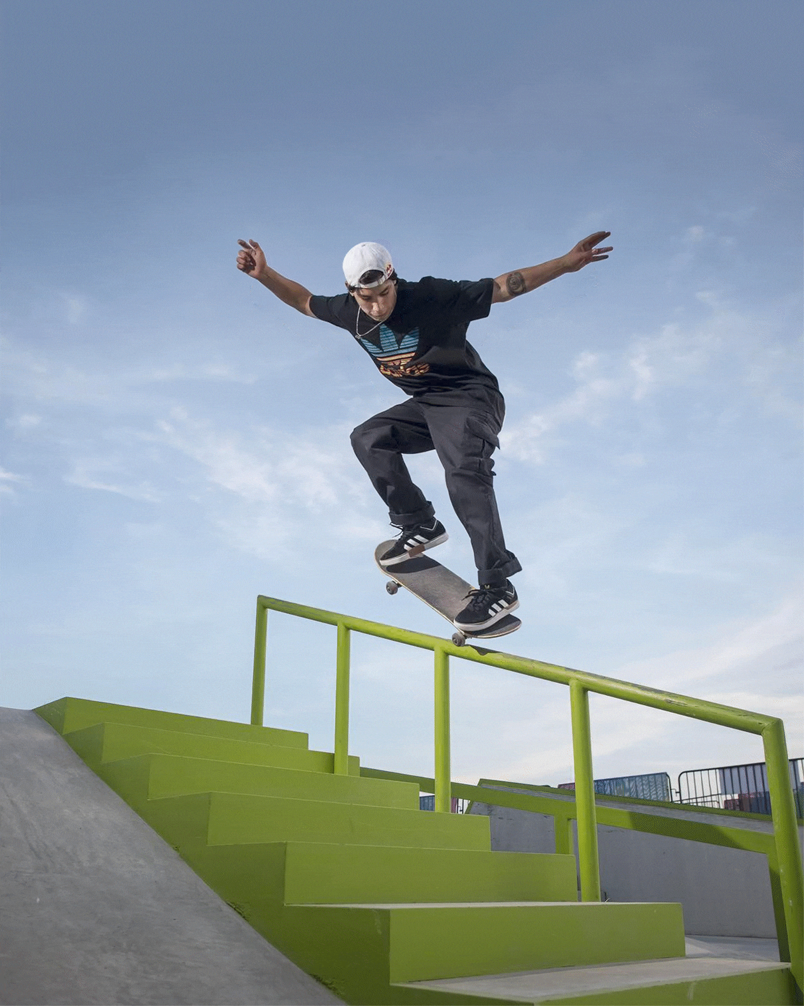
2. Stylish Brand Touches
-
I noticed the stairs needed a change to better align with Red Bull's aesthetics. I applied a color mask and transformed the stair color to a vibrant red, matching the brand’s iconic style. This subtle detail helped integrate the setting with the bold spirit of the sponsor.

3. Typography with Attitude
-
Choosing the right typography was essential. I looked for one that reflected both Angelo’s urban style and Red Bull’s energetic essence. Without a personalized signature, I selected “TheSignature” font to give his name an authentic touch and added a Bold version that’s strong and easy to read. The contrast between both typefaces captures the balance of strength and street style.

4. Adding Depth to the Text
-
To add a touch of creativity and dynamism, I replicated Angelo’s name in three layers, adjusting each with a transparent outline that gently fades downward. This effect creates visual depth that highlights his name while suggesting movement and energy.

5. Bringing the Protagonist Forward
-
Angelo isn’t just in the image; he’s the center. I created a dedicated layer for him, ensuring that he appears in front of the text. This technique gives the poster a unique feel, as if he’s literally jumping off the page, creating a visual connection that captures immediate attention.

6. Logo with a Drop Shadow
-
To ensure the Red Bull logo stood out, I added a subtle drop shadow, giving it dimension against the background. This detail adds professionalism and ensures the brand’s logo has a prominent place in the composition.
.png)
7. The Final Test on a Mockup
-
With all the elements in place, I wanted to see how the poster would look in a real-life setting. I placed it on a mockup of a street panel, and the result was incredible: the design comes alive in an urban context, perfectly fitting the energy of both Red Bull and Angelo.